Kokios 2010-ųjų dizaino tendencijos?

Tarptautinė brandingo kompanija "CBX" savo bloge apibūdina 2010-ųjų dizaino tendencijas. Pacituosiu:
In 2010 consumers have an enormous amount of brand awareness, and are looking on some level for an emotional connection. Last year we saw many brands eliminating the clutter in visuals and messaging. Now, it’s time to get consumers excited when they least expect it in a time where people are working more than ever and yearn for human connection.
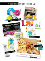
Brightly colored graphics, patterns and icons. Happy, playful patterns in unexpected places like the above kate spade store interior or a coffee cup stealing cues from interior design. Bright, pop colors are embraced but always with a sense of balance to maintain maturity and avoid a circus effect.
Easy to handle, slimmer, greener structures. Consumers are looking for simple structural solutions that can make their experience unique, whether it’s convenience driven or something more indulgent that draws them in. Method kicks of 2010 with a ground breaking laundry detergent. It’s greener, concentrated and has a squirt bottle design that eliminates the messy drip from the bottle. They took the ever so boring experience of doing laundry and introduced something that solved multiple problems. Who wouldn’t be excited about that?
Removable and minimal branding continues to be a positive for consumers seeking discretion and trust. Removable sleeves (like Cleangenuity above), belly bands, stickers, tags, and embossing are just around the corner.
Tiring to inspiring Private Labels. Target’s re-invented value brand “up &up” clearly marks every package with a large color coded bold arrow icon paired with a sometimes clever product photograph. It brings vibrancy to the shelf and also helps target shoppers shop smarter, quicker and most importantly makes consumers feel good about purchasing a value brand.


Komentarai